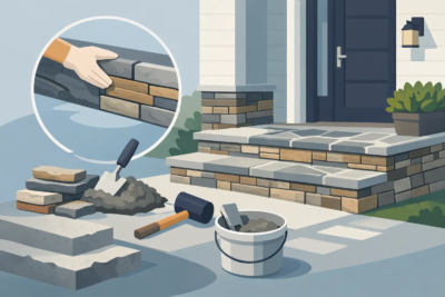

A stone veneer sample can look perfect on a table, then feel entirely different once mortar surrounds every piece on a chimney, foundation, or front entry. That is why knowing how to select mortar color matters before installation begins. Mortar is not simply the material between the stones. It becomes part of the finished surface, influencing whether your veneer looks crisp and tailored, weathered and traditional, or softly blended from the street.
For Shenandoah Valley homes, the best choice often begins with the character you want the finished project to carry. A farmhouse with fieldstone may call for a warm, relaxed joint. A new build with stacked stone around the entry may need a cleaner, more restrained look. The right mortar color supports the stone profile, the home’s existing exterior colors, and the architectural details that make the project feel complete.
Start With the Stone’s Undertones
Do not choose mortar by matching only the most noticeable color in the stone. Manufactured stone veneer often contains several tones: grays, buffs, browns, charcoal accents, rust, cream, or touches of blue. The most successful mortar color usually relates to the stone’s overall undertone rather than its darkest or lightest individual pieces.
Lay out a representative selection of stone on the ground or against the wall. Include corner pieces if they are part of the project. Step back far enough that the individual stones begin to read as one surface, then look for the color that appears most consistently through the blend. That dominant impression should guide the mortar choice.
A warm gray mortar can work beautifully with stone containing taupe, tan, and weathered brown. A cooler gray mortar may suit a blend with charcoal, slate, and blue-gray notes. Buff mortar often complements cream, sand, and lighter brown stone, while a deeper brown mortar can reinforce the richness of earth-toned fieldstone or ledge stone.
The goal is not always a perfect match. A close match creates a more unified, quieter wall, while a contrasting mortar makes individual stones stand out. Neither approach is automatically better. It depends on the look you want and how much visual movement the stone profile already provides.
Decide Whether You Want Blend or Contrast
This is the central design decision when selecting mortar color for stone veneer. Matching mortar reduces the visual separation between stones. The wall reads as a cohesive field of texture and color, which can make a smaller chimney, fireplace, or interior accent wall feel less busy.
Contrast does the opposite. A lighter mortar around darker stone defines every piece and can bring a classic, hand-laid character to a façade. Darker mortar against lighter stone adds depth and a stronger pattern. This approach can be especially appealing on traditional homes, where visible joints contribute to the architectural style.
There is a trade-off. High contrast is memorable, but it also makes installation details more visible. Joint thickness, stone spacing, and workmanship become prominent parts of the design. A blended mortar is more forgiving and often gives manufactured veneer a natural, continuous appearance.
If you are uncertain, choose subtle contrast instead of dramatic contrast. A mortar that is one or two values lighter or darker than the stone’s overall tone can add definition without competing with the veneer itself.
Consider the Stone Profile
Stone shape has as much influence on mortar color as stone color does. Rough, irregular fieldstone already has a great deal of texture, variation, and shadow. It often looks best with a mortar that blends into the mix rather than outlining every irregular edge.
Ledge stone and stack stone have stronger horizontal lines. A mortar that is close in color can keep those lines clean and contemporary. If the goal is a more rustic appearance, a warmer or slightly contrasting mortar can emphasize the layered, hand-set effect.
Cut stone typically has a more formal rhythm. It can handle a more deliberate joint color because its edges and course lines are orderly. For entry columns, façades, and architectural accents, select a mortar that also works with nearby trim, shutters, siding, and masonry.
Look at the Entire Exterior, Not Just the Veneer
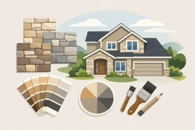
A good mortar color should make sense from the curb. Before finalizing your selection, place the stone and mortar samples next to the siding, brick, stucco, painted trim, roofing, and hardscape materials that will remain in view. A mortar that looks neutral on its own can lean pink, yellow, green, or blue when paired with surrounding finishes.
This is particularly relevant for renovation work. On a dated brick foundation or a new chimney addition, the stone veneer should look intentional alongside the existing home. Cool gray mortar may clash with a warm red brick or beige siding. A soft buff or taupe may create a better transition.
Also consider coordinated finishing pieces. Wall caps, pier caps, keystones, address numbers, and column details occupy small areas, but they can pull the design together. Mortar that relates to these elements helps the stonework look planned as one architectural feature rather than added in separate stages.
View Samples in Real Outdoor Light
Morning shade, midday sun, and late-afternoon light can all change how mortar appears. The same is true of a north-facing foundation and a sunny front elevation. Never make the final call from a showroom sample alone if you can review it at the project location.
Moisture changes the equation, too. Stone and mortar commonly appear darker when wet, especially after a Virginia rain. Look at sample materials in both dry and damp conditions. If the veneer will be used around a pool, outdoor kitchen, retaining wall, or heavily shaded area, this step becomes even more useful.
A larger sample is more reliable than a small color chip. Build or request a mockup that includes several stones, realistic joint width, and the intended mortar finish. Stand back from it at the distance where visitors will see the wall. From ten or twenty feet away, the mortar may visually occupy more of the surface than expected.
Joint Style Changes the Color’s Effect
Mortar color and joint treatment work together. A flush joint, where mortar is finished close to the face of the stone, creates a relatively clean, even appearance. This style lets the color relationship between stone and mortar read clearly.
A recessed joint increases shadow and can make mortar less visually dominant, even if the color contrasts with the stone. Overgrouted or heavily tooled joints create a more rustic, old-world character and place greater emphasis on the mortar itself.
Joint width matters as well. Wider joints mean more visible mortar. If your installation will have generous joints, avoid a color that feels too stark unless a pronounced traditional look is the goal. Tighter joints allow more attention to stay on the stone profile.
Talk through the intended joint style with your mason before materials are ordered. A mortar color that looks right on a flush-joint sample may behave differently in a deeply recessed or rustic application.
Think About Maintenance and Aging
Mortar is durable, but exterior surfaces collect dirt, pollen, splashback, and weathering over time. Very light mortar can show soil near grade, beneath downspouts, or on exposed landscape walls. Very dark mortar may reveal dust or light-colored mineral deposits in certain conditions.
Mid-tone gray, taupe, and buff options are often practical choices for busy exterior areas because they are less likely to highlight everyday grime. That does not mean pale or dark mortar should be avoided. It simply means the location should influence the decision.
Expect the finished mortar to vary slightly from a dry sample. Weather, curing conditions, moisture, sand, and craftsmanship can all affect the final appearance. Consistent mixing practices and proper installation are essential, especially on large wall areas where color variation would be more noticeable.
A Simple Way to Make the Final Choice
Narrow your options to two or three mortar colors that fit the stone blend and exterior palette. Review each one in a full-size mockup at the actual project site. Look at it in direct sun, shade, and after wetting the surface lightly. Then ask one practical question: do you want people to notice the stone first, or the pattern created by stone and mortar together?
If the answer is the stone, choose the closer blend. If the answer is the pattern and craftsmanship of the masonry, choose measured contrast. For homeowners who want a second set of experienced eyes, Grizzly Stone can help align veneer selection, mortar direction, and finishing details before the work begins.
A well-chosen mortar color does not demand attention on its own. It gives every stone a place, supports the home around it, and helps a new exterior feature look as though it has always belonged there.